I am currently working on other logos which I will upload once the clients approve the designs and begin to use the logos publicly.
The Therapy Centre
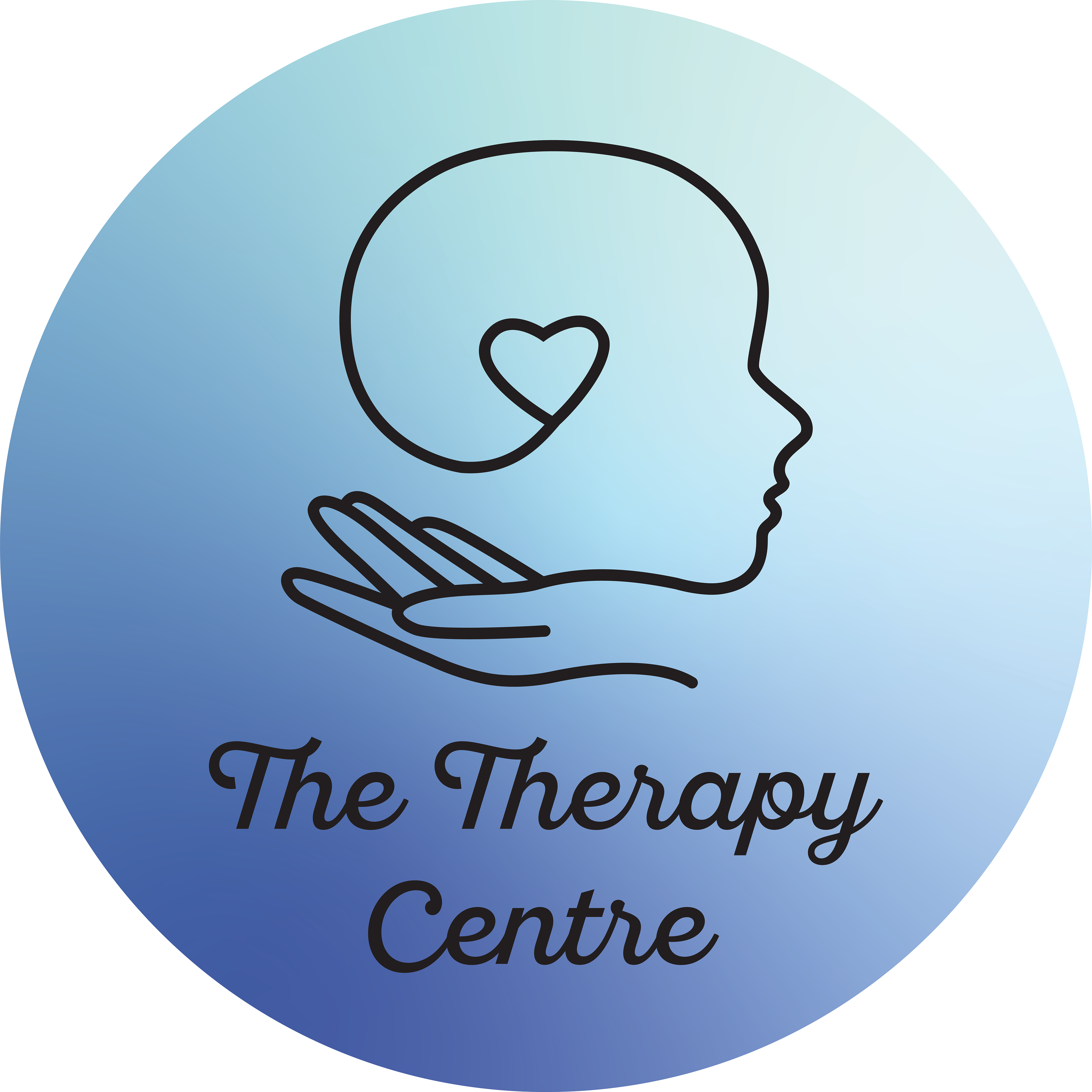
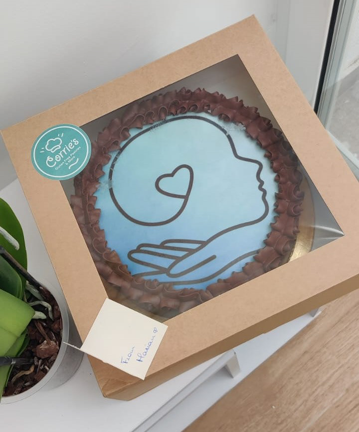
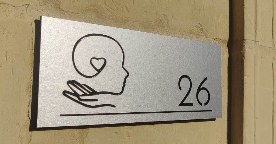
These are concept logos that were designed for a client who started her own psychological Therapy Centre. I chose to go with calming colours and a delicate design that exudes piece of mind. The gentle design of the hand represents my client, whereas the head it holds up represents the people the clinic will be helping with their services. I went with a script font because I felt like it complemented the logo's style very well.
Give or Take theatre
This logo was created for a Maltese theatrical group that are a more adult version of More or Less Productions. They wanted to use a darker colour scheme and a more retro looking font to give the idea that they are a little more serious than their sister group. I chose to add the hands to symbolise giving and taken whilst also giving it the feel of a stage-hand's glove. I also made it look more like stained glass to give it a more vintage feel.
Texting panda
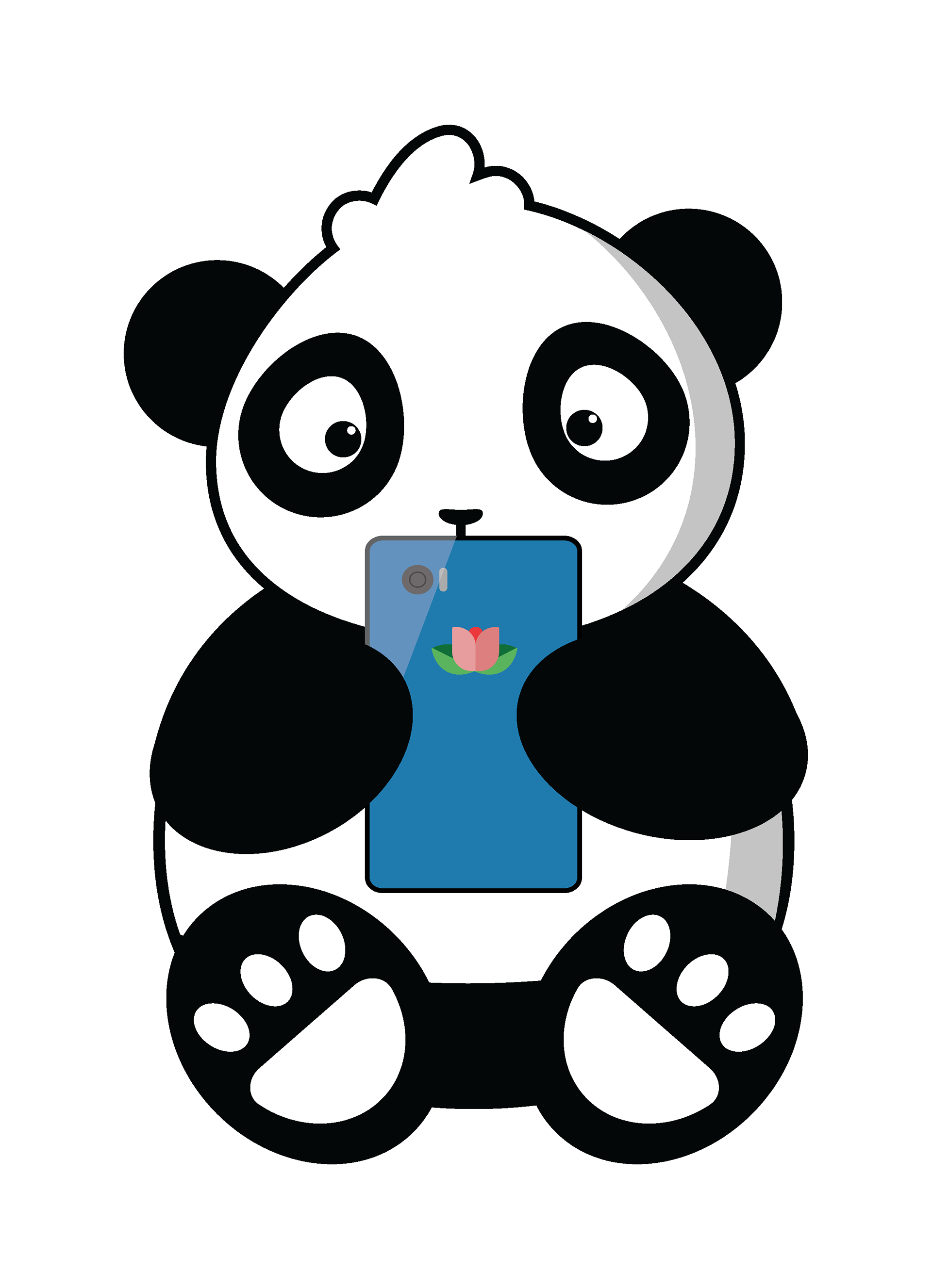
This logo was created for an award-winning local app called Texting Panda. The winner of ICTSA's 'The Million Dollar Idea' came up with the idea of texting an artificially intelligent self-care expert panda to help improve mental health. He wanted to have a very cute, approachable panda as the mascot for this app. The text part of this logo incorporates a speech bubble similar to those found on messaging apps on mobile phones. I created a panda emoji which can be used separately. I created the visual of a sitting panda in order to have a separate glyph which can be used without text.
Play-Up Café
This logo was done as part of a re-branding and new opening of a café for gamers. The owners wanted to show that their premises will be available for people to come enjoy a coffee with friends whist being the spot for them to play table-top and console games. They distinctly wanted the logos to be in a cute style, so I opted for flat design with cute anime-like faces. They wanted to include coffee cups in the logo, so to make it a little different from existing logos, I included a travel mug. I wanted to include dice to show the game aspect, and decided on a 20-sided dice to represent table-top games rather than gambling games. It was the owners' choice to have both the cups playing with 20-sided dice of different sizes.
Makeup by Marylyn
This logo was designed for an upcoming young makeup artist who didn't have any brand representation and wanted to present herself and her work in the local film industry. Using her own photos as a guide, I created a stylised version of her face to use as a logo alongside the name she had chosen for her makeup business.
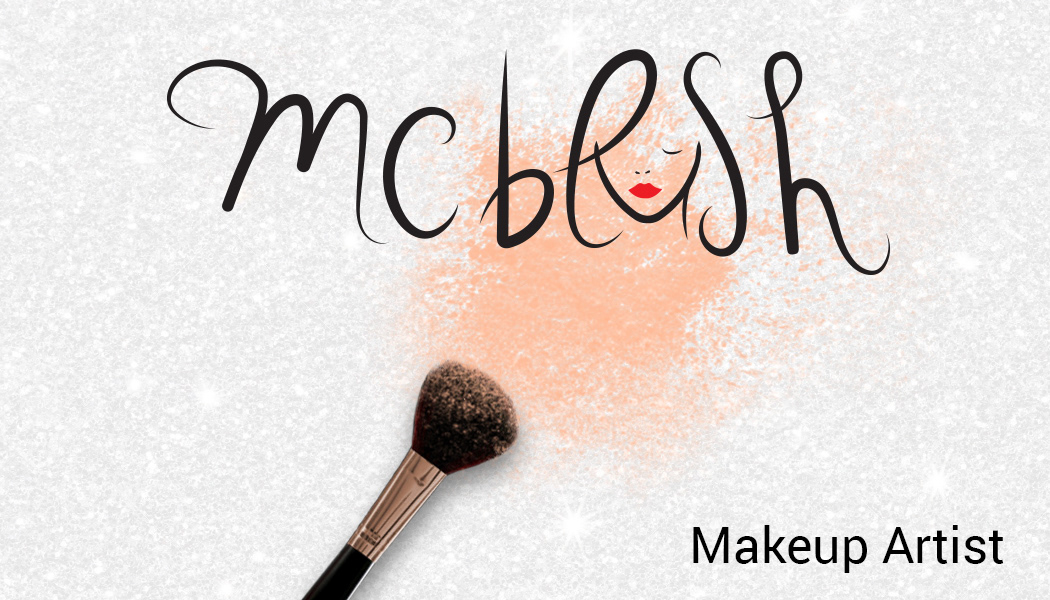
M C Blush
This logo was designed for a client looking to open her own beauty company. She wanted to portray a fun, easy-going experience and wanted small elements of elegance and femininity through her logo. After discussing what she wanted, I went ahead and developed this logo from her ideas. I incorporated a woman's face into the logo's text with the L and the S outlining the woman's hair. I used a simple line for the eye to hint at the use of eyeliner and added the red lipstick to show the makeup element. To be able to include the client's suggestion for a blush brush and her favourite colours (silver and orange) I added them to her business card.
KBC Photography
This logo was designed for a local photographer, Kurt Borg Coppini, who was looking to replace the text watermark he had been using on his photos. He wanted something that was immediately recognisable without being intrusive. I decided to use a camera as a symbol because it's universally recognised and very self explanatory. I used a rounded font since the client wanted to show a "fun" element when using the logo.
My Personal Logo
This is a logo I made for myself. I wanted to capture my personality in a logo and have it be recognisable at the same time. I used the 'g' to represent Greta, but at the same time represent my glasses which have become an integral part of my image. The bracket beside the 'g' is there to make the logo look like a bespectacled smile.
The Writers Club
This is a logo that I designed when "The Writer's Club" wanted to rebrand their image. This logo is the one currently being used. The bold lettering at the beginning of each word was done because the members often refer to the group as TWC in short. The purple ink colour was specifically chosen to represent the diversity of the members and their writing styles.
CWAM - Creative Writing Alliance Malta
This is the logo I designed when I was head of design with the Creative Writing Alliance of Malta. The green colour was chosen to represent creativity and to keep with the original colours of the club it originated from. This logo was used from 2014 to 2016. It was later slightly modified when possession of the group changed management.
A.I. Department Logo
This logo was made for The University of Malta's AI department. They wanted a logo to show their advancements in robotics and artificial intelligence. I created this logo with the intention that the robot forms the letter "i" in the silhouette of the letter "a".
Mint Charm
This is a logo and mascot I created for an artisan shop on Etsy.com. The creator wanted something cute and whimsical to add to his business card and to be the profile picture on his shop page. This was used between 2015 and 2016.
Quickfire
This was one of the concepts presented to the group Quickfire as part of their rebranding. Since the company deals with gaming, I envisioned having a mascot, in this case a little flame-man, which could be re-drawn and re-positioned according to the events they would be hosting. Although this concept was not the one chosen, it has lead to the current logo they use.
